Raising donation form completion from 18% to 72%
A research-led redesign of Oxfam GB's donation form, and the hypothesis-driven investigation that caught a silent drop in legacy and in-memory donations after launch, before it caused lasting damage.
The problem
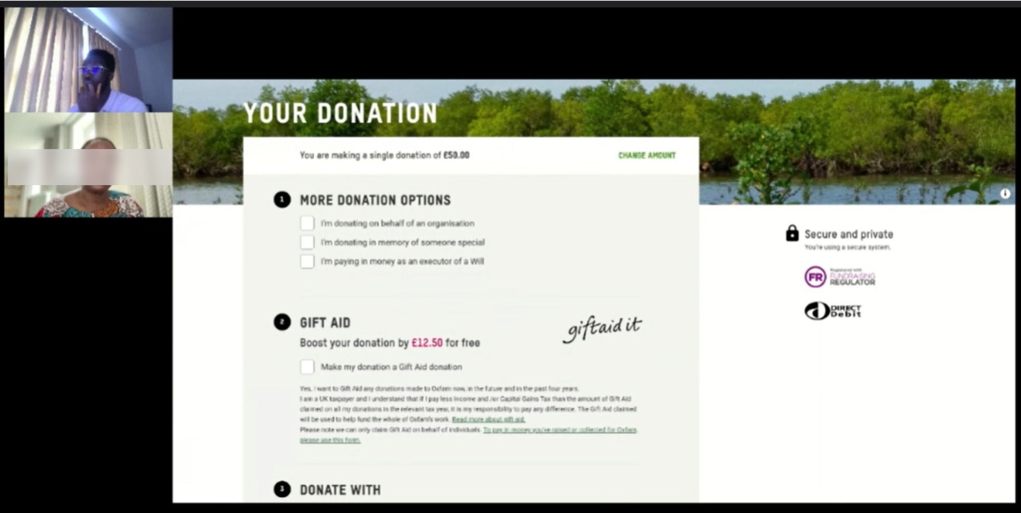
Oxfam GB's donation form didn't clearly distinguish between the different reasons someone might be giving: a personal donation, a gift In Memoriam of someone who had died, or a contribution from an Executor settling a legacy. Without clear categorisation, the Oxfam Legacies team couldn't reliably track which donations were which, respond to supporters appropriately, or keep accurate audit records.
The Insight team's quantitative and qualitative data confirmed just how far this had gone: almost 100% of donations were being recorded as personal donations, with virtually no in-memory, legacy or fundraising donations coming through at all. That wasn't because those donors had stopped giving, it was because they couldn't see themselves reflected in the form, and dropped off rather than force their donation into a category that didn't fit.
Fixing that classification problem meant redesigning a form used by a huge volume of donors, without disrupting the giving experience for any of them.
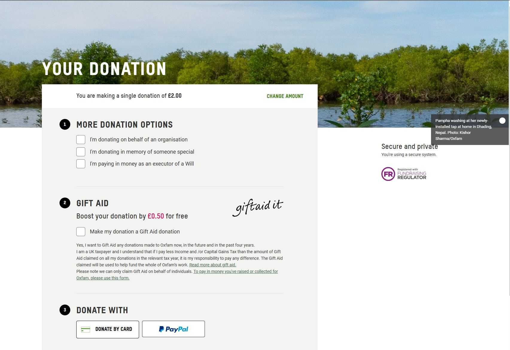
Below is what that form looked like before the redesign: a screenshot of the live "Reason for donating" step, followed by a short recording of how donors actually moved through it.
My role
I led user research and design end-to-end: defining the problem through personas and competitor analysis, testing prototype directions with real donors, and, after launch surfaced an unexpected regression, running a second, hypothesis-driven investigation to find and fix the root cause.
Alongside the research and design work, I managed both internal and external stakeholders, keeping the Legacies team, developers and Torchbox aligned on the same goal throughout, and stayed close to impact metrics after each release to catch implementation issues early rather than after they'd compounded.
Research & discovery
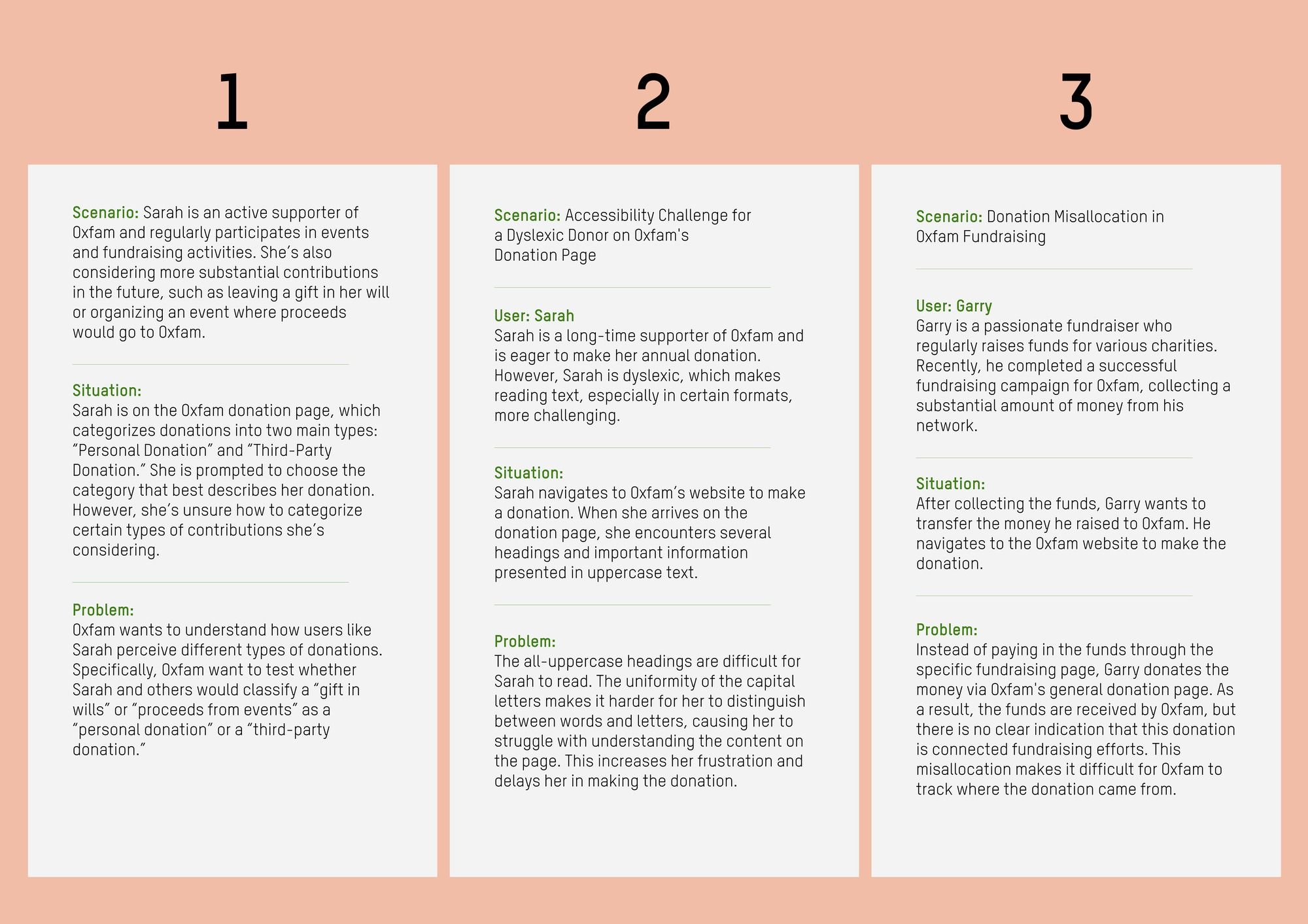
I started by building personas and scenarios to ground the redesign in specific user needs, rather than assumptions about how donors think about "reason for giving." Three scenarios shaped the brief:
- Sarah, a long-time supporter considering a gift in her will or an event with proceeds going to Oxfam, had no way of knowing whether either fit under "Personal Donation" or "Third-Party Donation," the only two categories the original form offered.
- Sarah, again, this time through an accessibility lens: as a dyslexic donor, she found the donation page's all-uppercase headings hard to parse, which slowed her down and added friction to a task that should have taken seconds.
- Garry, a fundraiser who'd collected donations from his network, paid the funds in through Oxfam's general donation page rather than a dedicated fundraising route, so Oxfam had no way to trace the money back to his campaign.
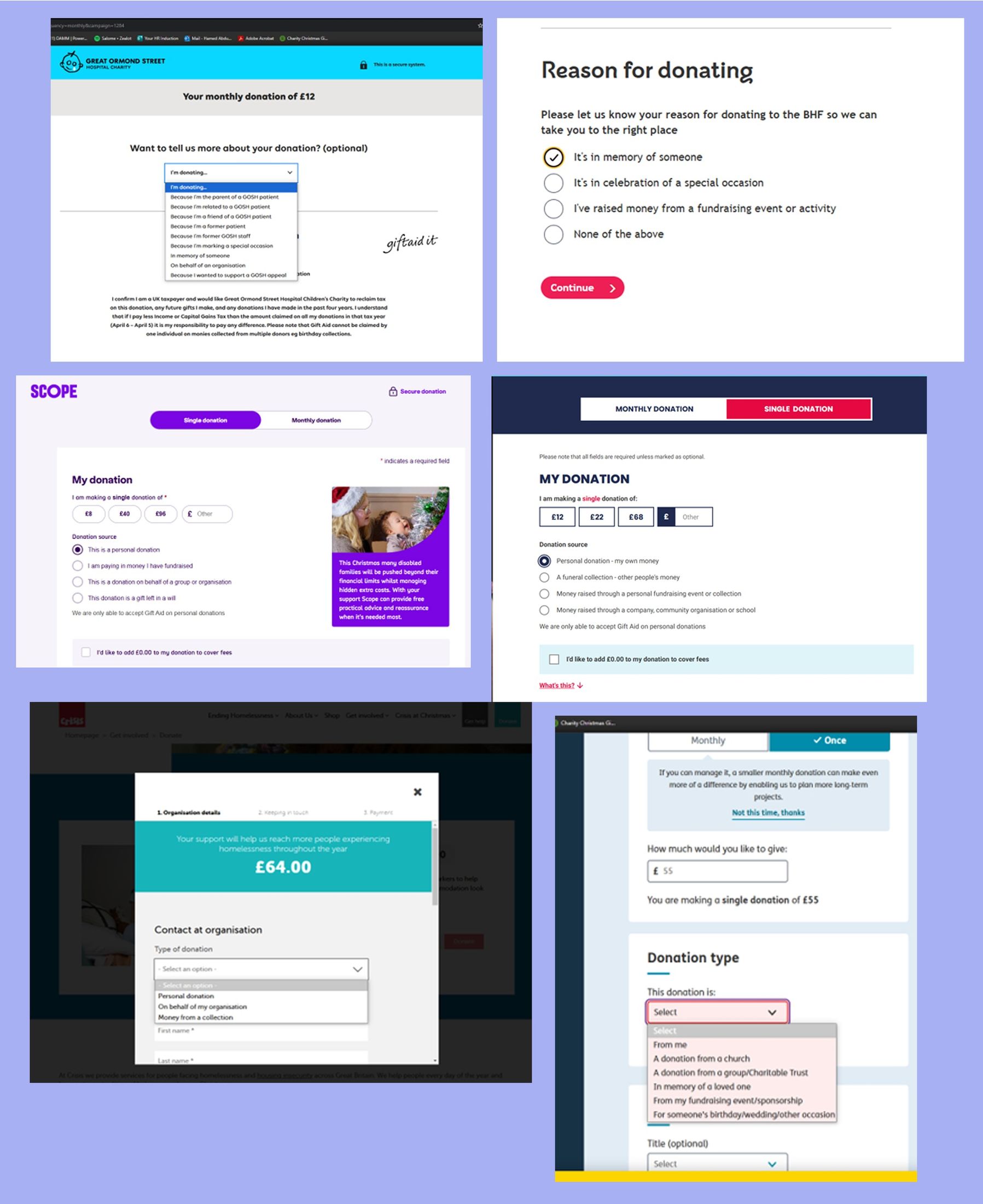
I also ran a competitor analysis across major UK charities, Red Cross, Crisis, UNICEF, Scope, Great Ormond Street Hospital and British Heart Foundation, to see how established organisations handled donation-reason categorisation, and where their interfaces still fell short.
Prototyping & usability testing
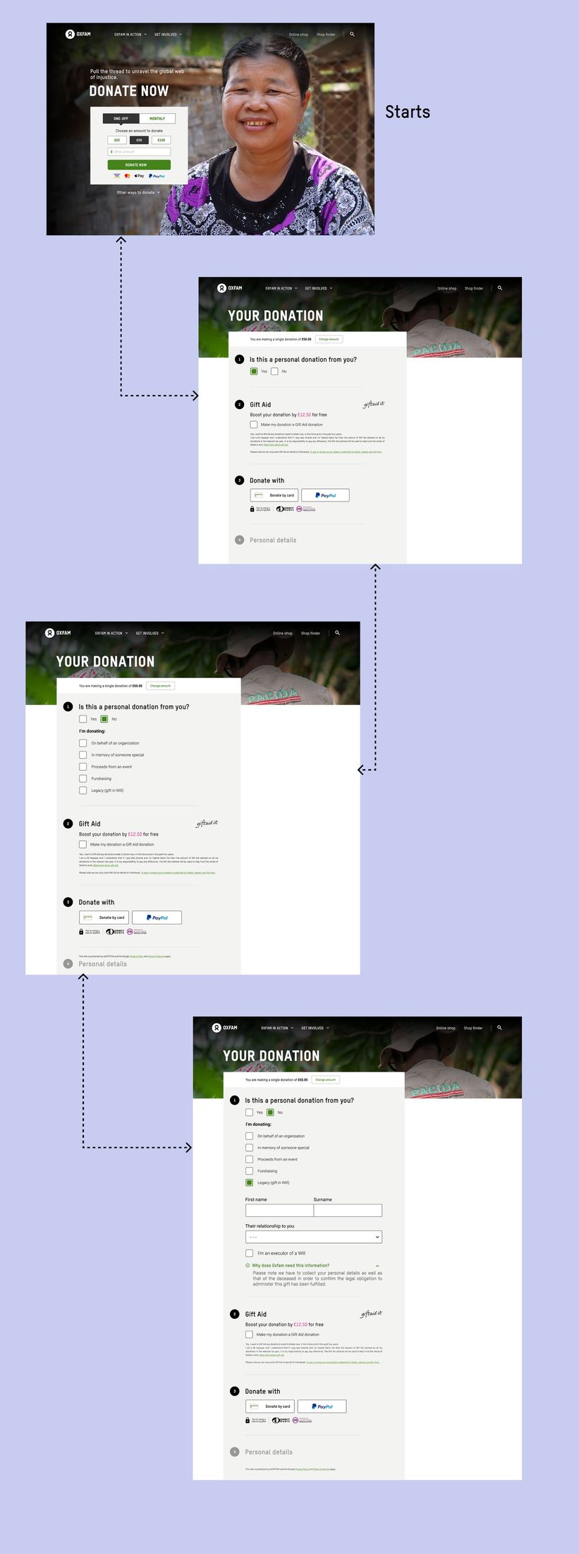
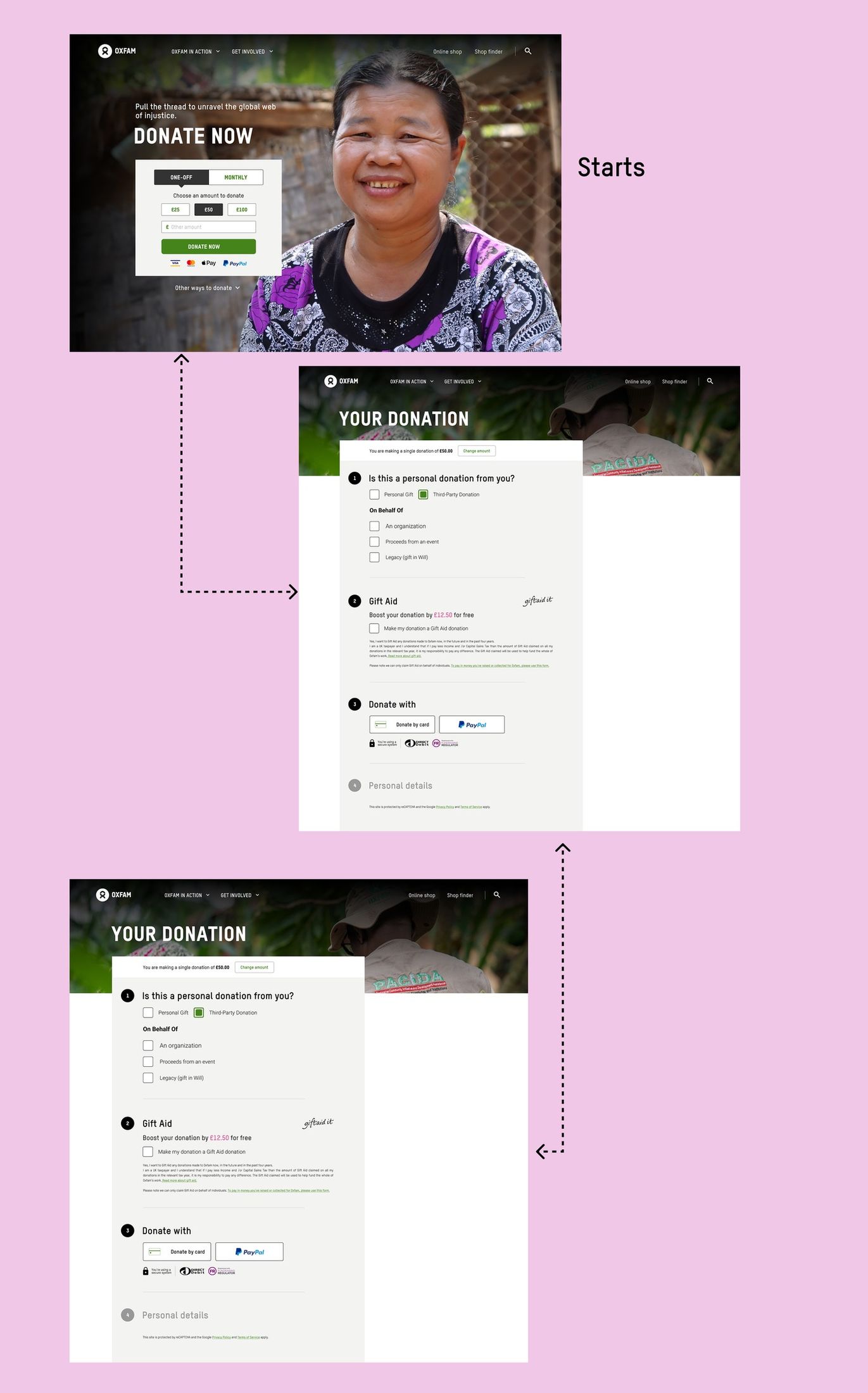
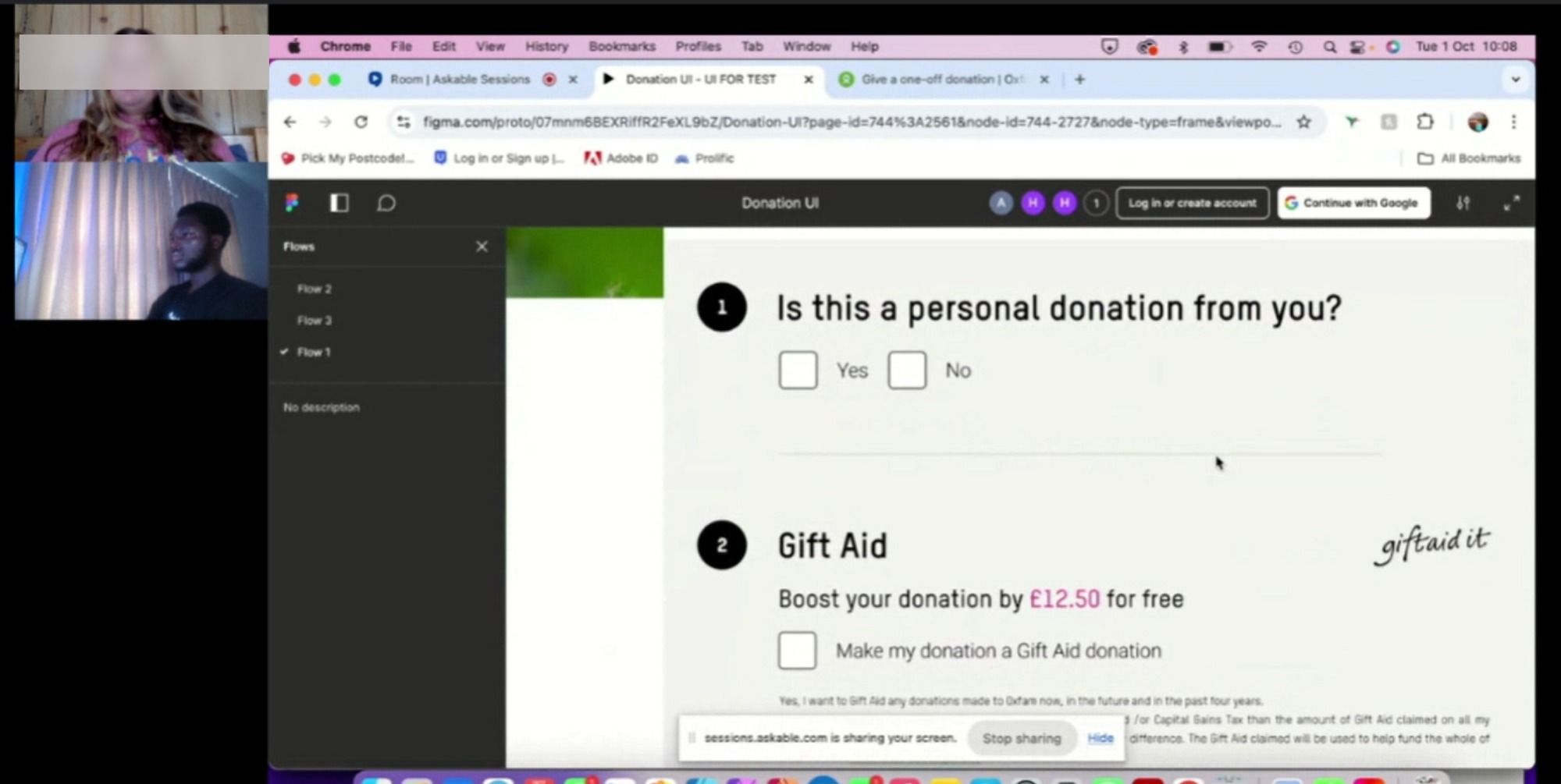
Based on that research, I built two prototype variants in Figma and tested both against the original design with 10 participants through the ASKABLE platform in moderated sessions. Prototype A asked a simple yes/no question, "Is this a personal donation from you?", then revealed on behalf of an organisation, in memory of someone special, proceeds from an event, fundraising and legacy (gift in Will) as distinct options. Prototype B grouped those same reasons under a single "Third-Party Donation" category instead.
The result was decisive: 9 out of 10 participants preferred Prototype A, citing its intuitive, straightforward interface. We moved forward with it.
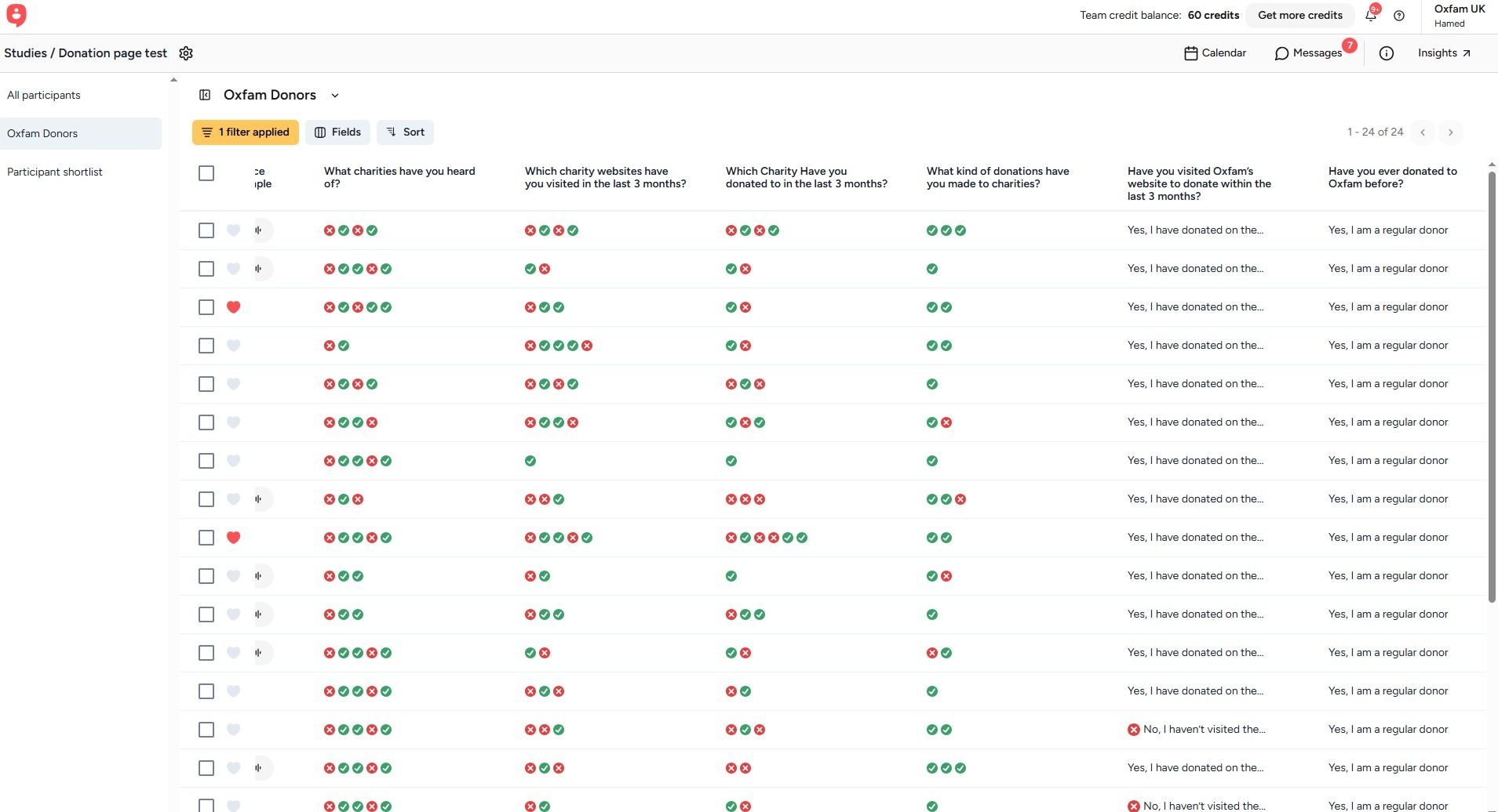
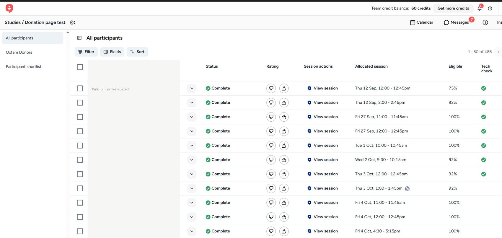
Participants were screened and recruited through ASKABLE, filtered down to people who were already regular Oxfam donors, then run through live moderated sessions where I watched them navigate both prototypes and talked through their reasoning as they went.
What the launch broke
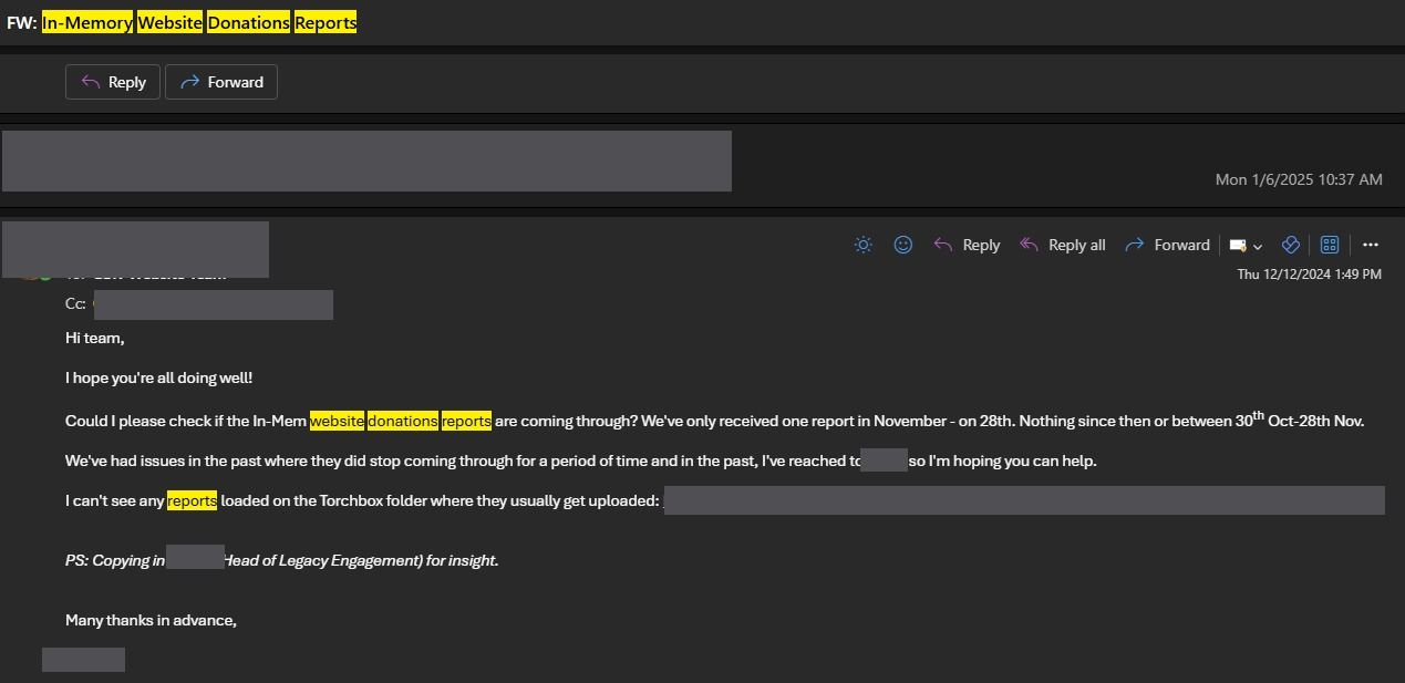
One month after the redesign shipped, the Legacies team reported that in-memory and legacy donations had effectively stopped coming through. A design that had tested well with donors was quietly failing the exact group it was meant to serve better.
Rather than guess, I framed the problem as a set of testable hypotheses:
- H₀ — The form changes, including preselecting "Yes" and hiding memorial donation fields behind an extra step, had no effect on the decline.
- H₁ — Preselecting "Yes" specifically caused the decline in In Memoriam donations.
- H₂ — Making all donation types visible upfront would improve In Memoriam donations by increasing their visibility.
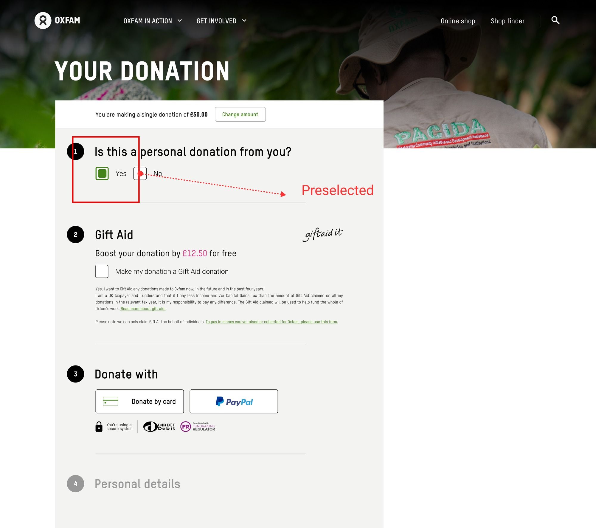
To validate, I reviewed over 20 Hotjar heatmap recordings of real donor sessions. The pattern was clear: because "Yes" was preselected, there was nothing left for users to interact with, so they never engaged with the component that would have flagged their donation as In Memoriam or legacy.
Redesigning around the real problem
The fix wasn't to revert the redesign, it was to reintroduce an interactive step without bringing back the friction the original redesign had removed. I designed a version that made donation-type selection an active choice again, while keeping the flow frictionless for the majority of donors giving for themselves.
From a broken toggle to a real choice
The preselected Yes/No toggle was replaced with a "Reason for donating" dropdown, defaulted to an unselected prompt rather than an answer. Donors now had to make an active choice, and every donation type, including on behalf of an organisation, in memory of someone special, and legacy gifts, was equally visible as an option rather than hidden behind a "No."
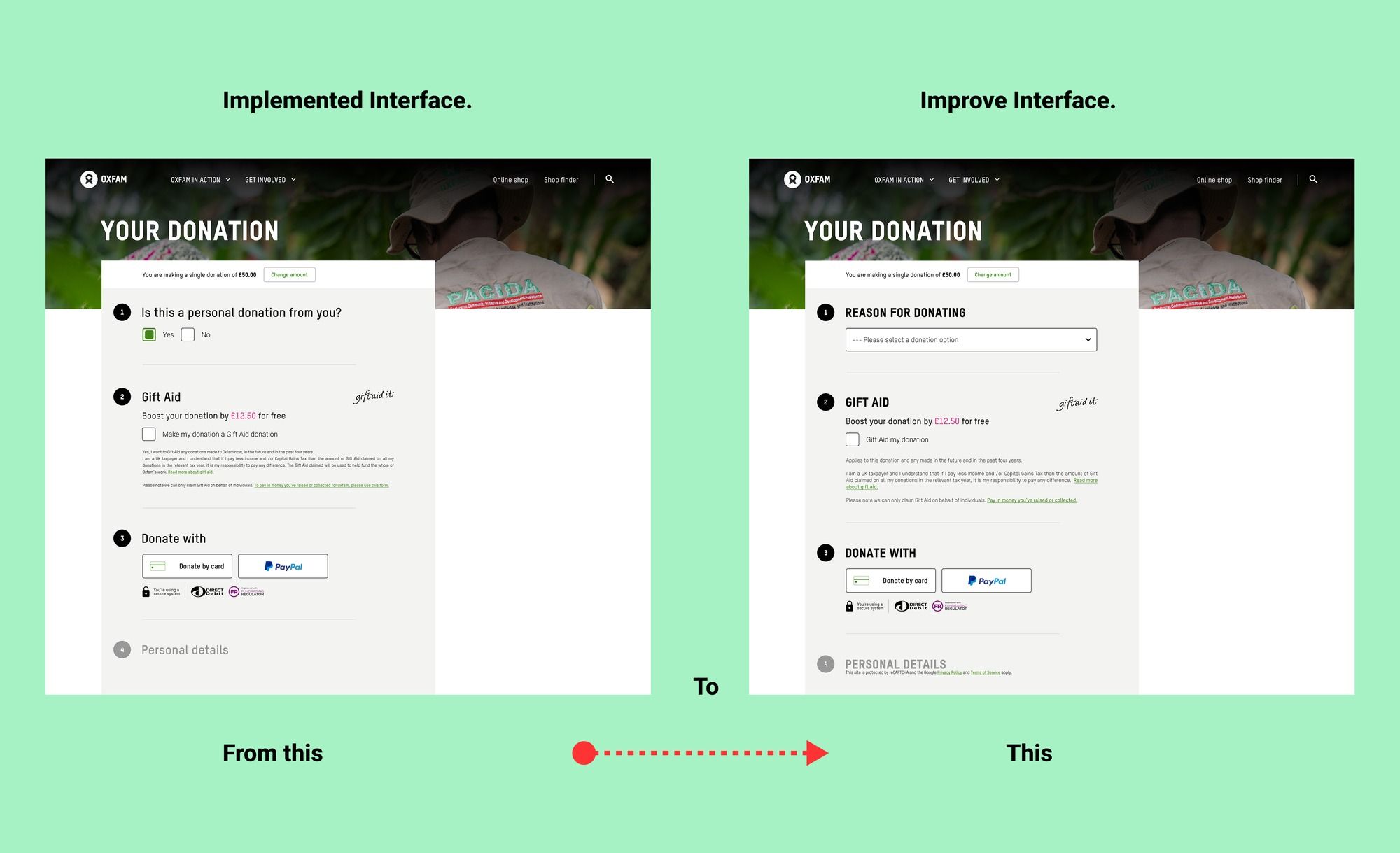
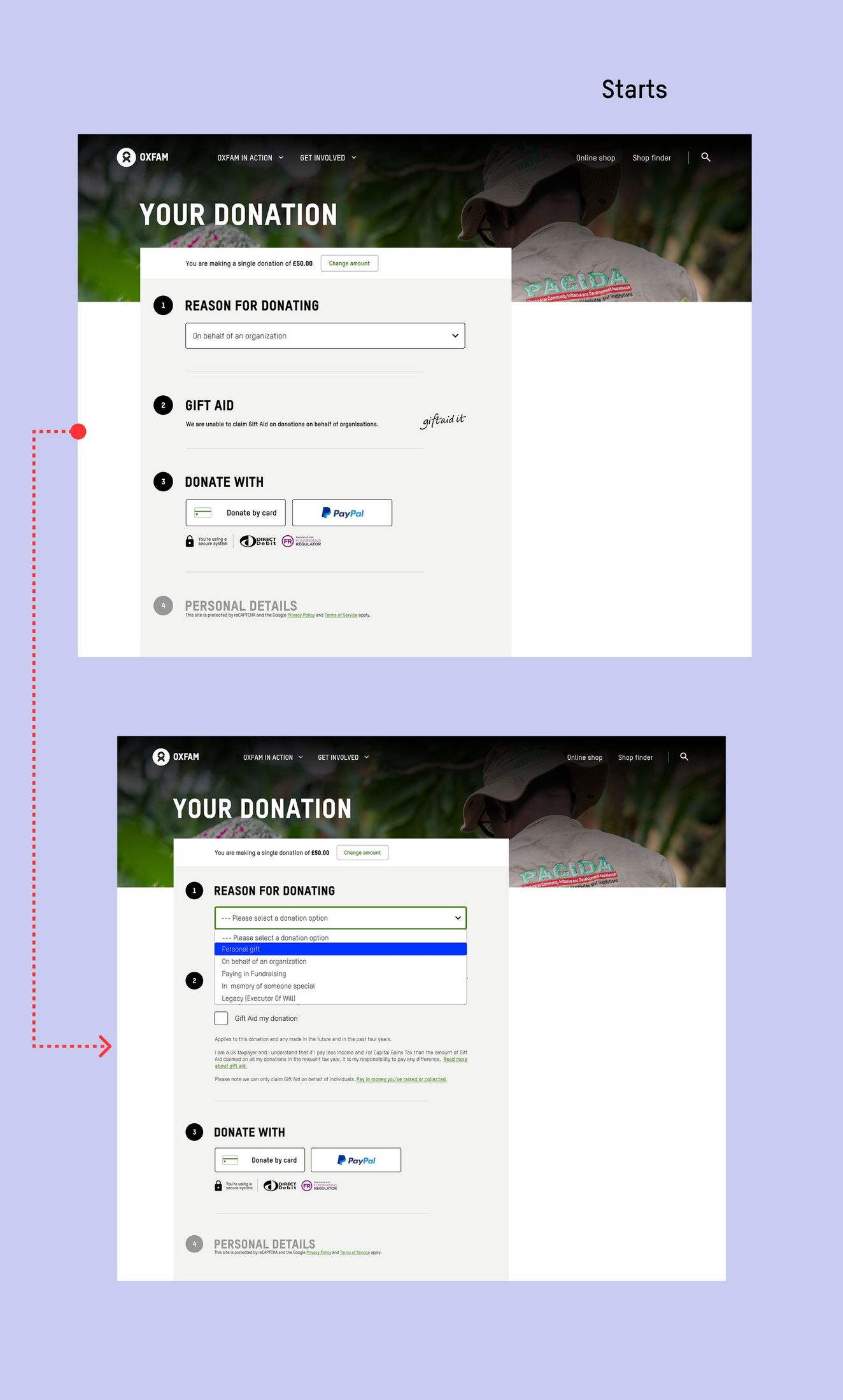
I extended the same pattern across the rest of the flow: a distinct path for donors giving through fundraising, a dedicated "in memory of someone special" selection with its own sub-form, and a clear inline error prompt when no donation reason was selected at all.
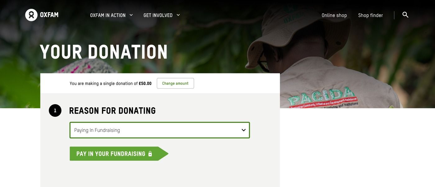
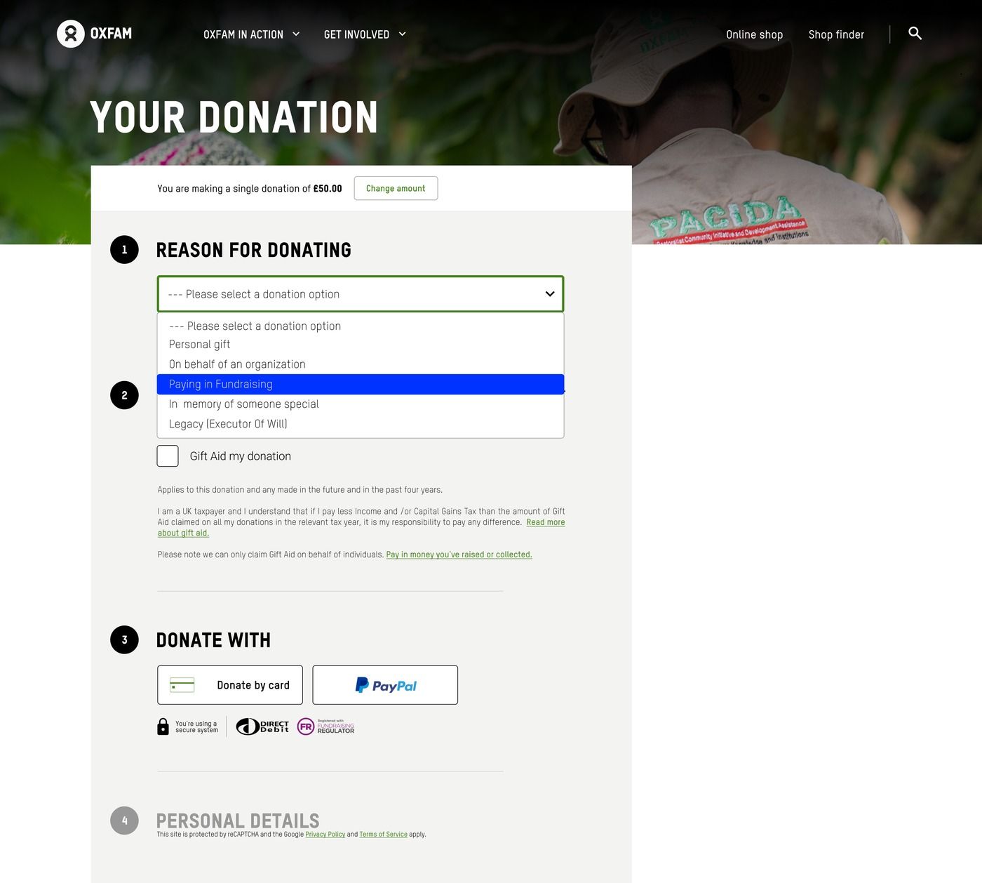
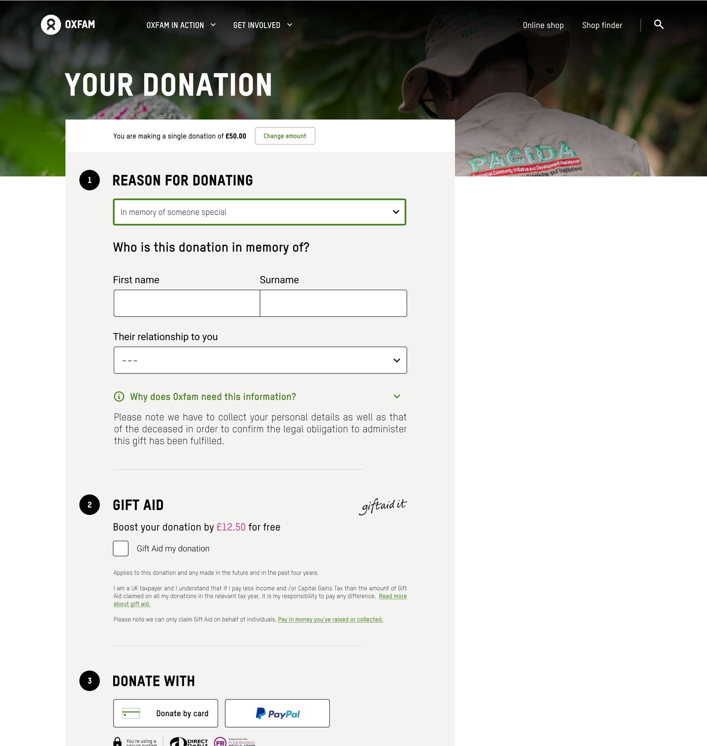
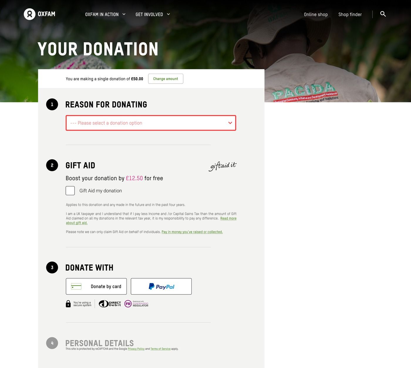
A donor who skips the question is told so, in text, rather than silently defaulted to "personal."
Retesting with real donors
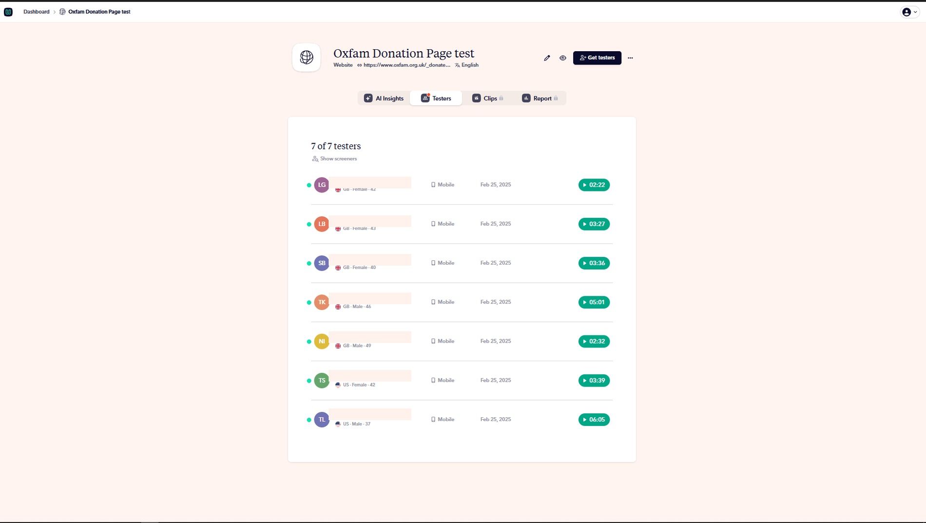
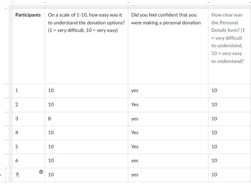
Because there was no approved research budget for a second moderated round, I tested the revised design with unmoderated usability testing via User Brain, on mobile, with 7 participants. Every participant found the design usable and actively interacted with it to select their donation type, resolving the regression.
Handoff to developers
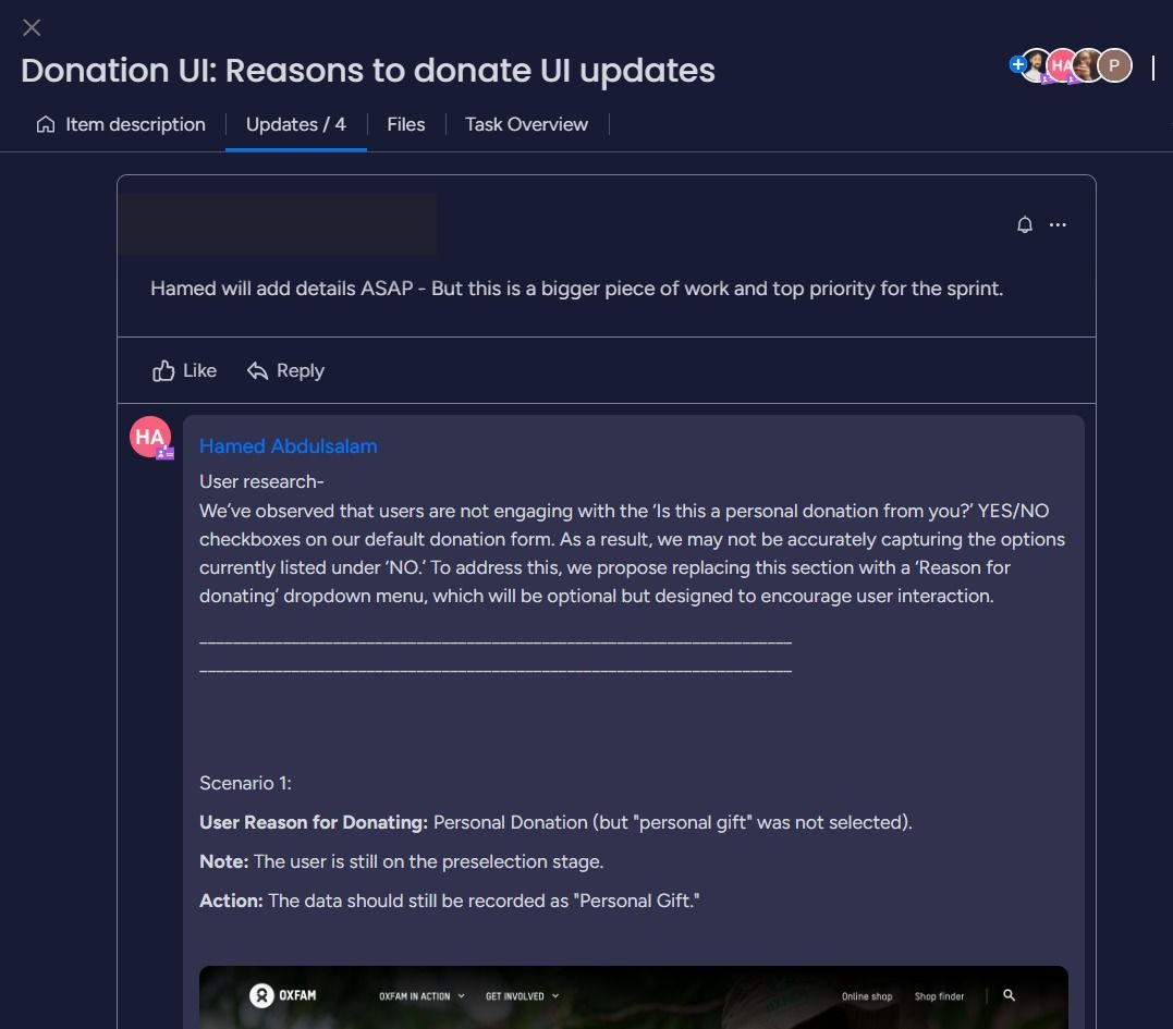
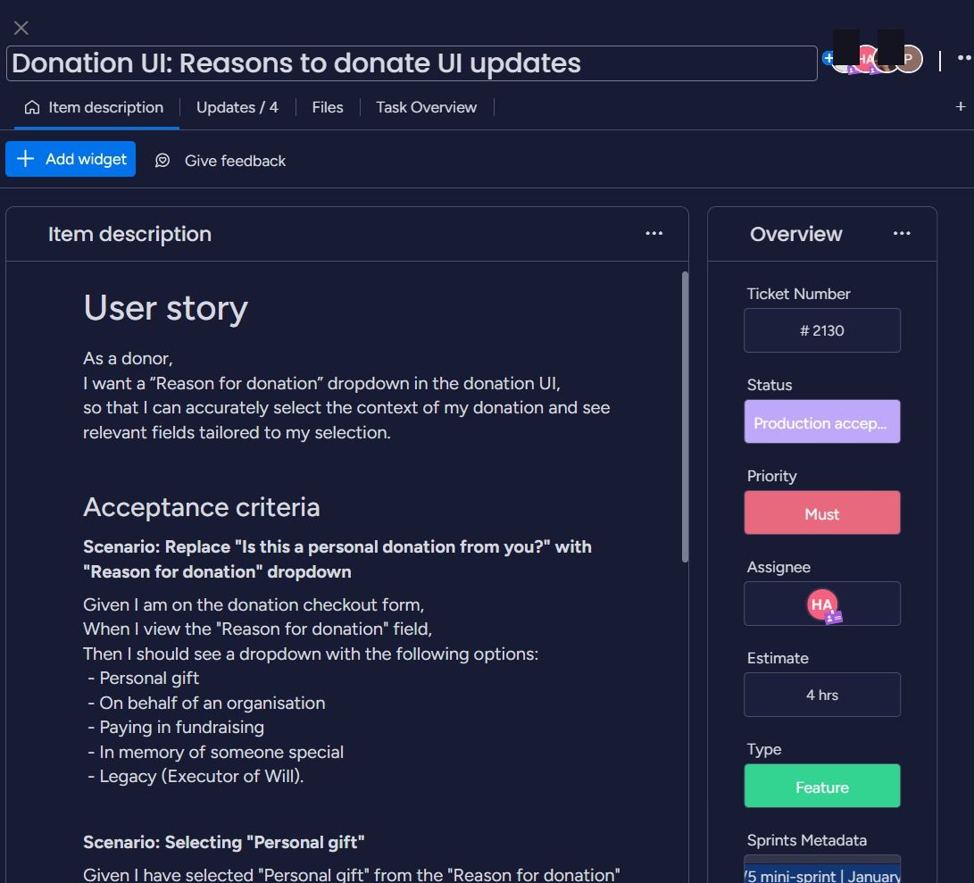
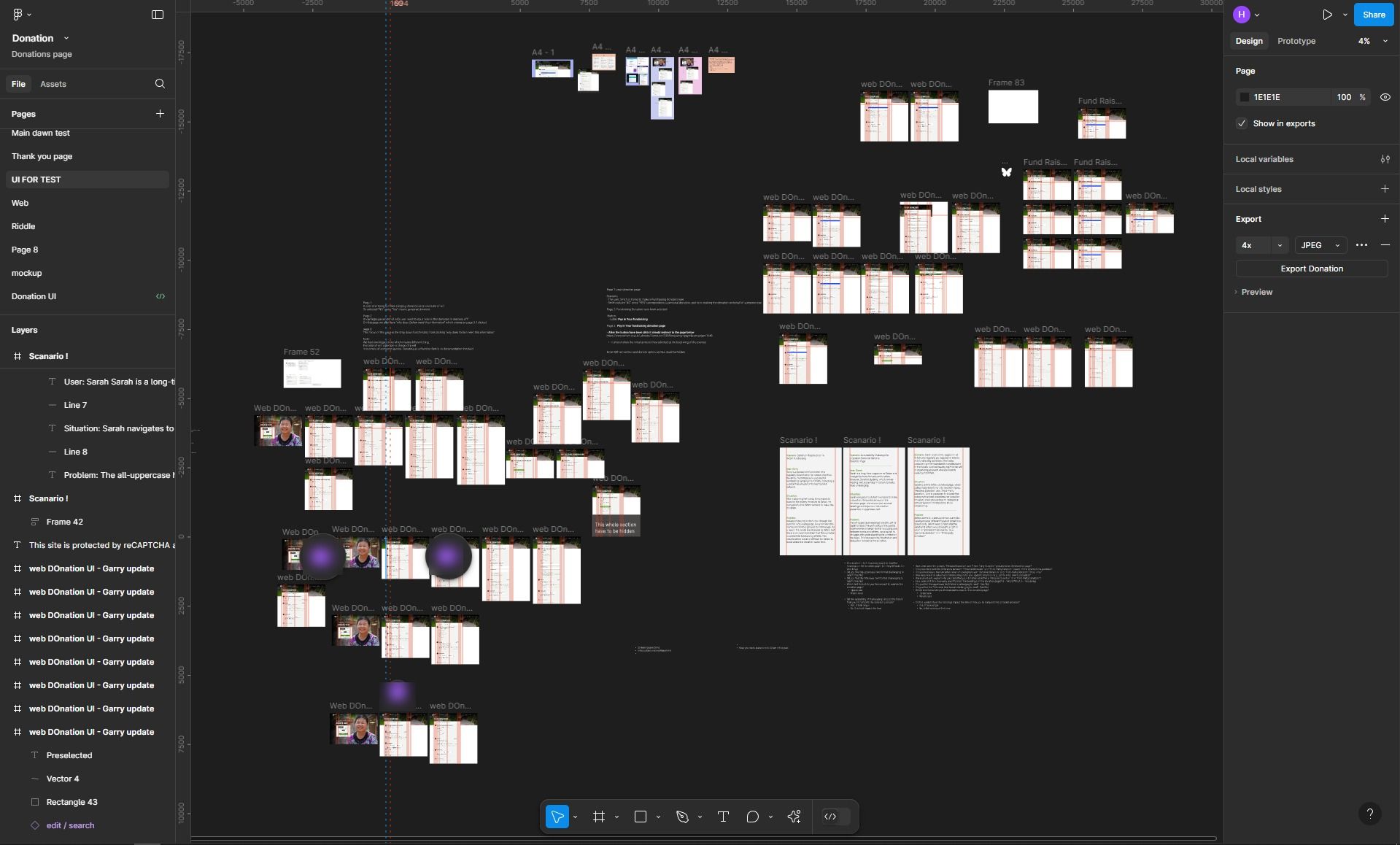
The finalised design was handed off to the development team through Monday.com, with the reasoning behind the change, a full user story and acceptance criteria attached, and a Figma file organised by scenario so engineering could trace every state back to the research that justified it.
Impact
The redesign, and the fix that followed it, delivered a meaningfully better donation experience without sacrificing the donation types it was built to protect:
- Form completion rate rose from 18% to 72%.
- User satisfaction scores improved from 20% to 70%.
- In-memory and legacy donations were restored to their pre-redesign levels, raising over £1M in that donation category.
Reflection
The biggest lesson wasn't in the redesign, it was in what happened a month after launch. A design can test well with 9 out of 10 users and still quietly break something a usability session was never going to catch, because the people it broke things for weren't in the room. Since then, I treat post-launch monitoring as part of the research plan, not a fallback for when something goes wrong. I also recommended the team adopt structured A/B testing for future interface changes, a standing feedback loop with the Legacies team, an analytics dashboard to monitor donation patterns, and quarterly research check-ins, so a regression like this gets caught in days, not a month.